The three images below show the process of the textured dinosaur skin. Using the overlay tool and placing the texture onto of the dinosaur I was able to achieve this one after the other.
My inspiration to recreate the poster 'Jurassic Parking' came from the image below:
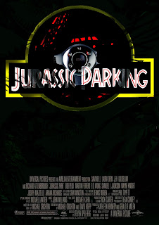
Due to the title of my film poster, I decided to add a steering wheel to fit the theme. To blend it in with the title I used the 'pin light' effect.
For the credits used below the poster, I downloaded the font 'accreditation' from DAFONT.COM to make my poster look much more realistic.
Below is the final outcome of my poster
References
Images
http://www.car2cover.co.uk/wp-content/uploads/2012/03/shutterstock_97542812.jpg
[Accessed on 28th July 2013]
http://www.rockshore.uk.com/ekmps/shops/rockshore/images/-basic-leather-steering-wheel-350mm-by-race-sport-2626-p.jpg
[Accessed on 28th July 2013]
http://www.studiohajo.nl/wp-content/uploadedImages/2009/04/jurassic-parking.gif
[Accessed on 28th July 2013]
http://chipkidd.com/journal/wp-content/uploads/2012/11/jurassic-park-movie-logo-chip-kidd-dinosaur.png
[Accessed on 28th July 2013]
http://www.walkingwithdinosaurs.com/suploads/edmontosaurus-scar_medium.jpg
[Accessed on 28th July 2013]
http://zonters.com/image/2013/04/jungle-wallpaper1.jpg
[Accessed on 28th July 2013]
Websites
www.dafont.com
[accessed 28th July 2013]


When your website or blog goes live for the first time, it is exciting. That is until you realize no one but you and your. fotoposter
ReplyDeletePretty good post. I just stumbled upon your blog and wanted to say that I have really enjoyed reading your blog posts. Any way I'll be subscribing to your feed and I hope you post again soon. Big thanks for the useful info. poster filters
ReplyDelete