Before designing logo ideas, I did some secondary research looking at make up logo brands:
Below are my sketched ideas I intend to use for my logo design:
Looking at the well know make up brands I noticed that they all tended to look rather simple and mainly come across as non italic and rarely bold in a sans serif or serif format. I decided to stick to this convention when creating my logo.
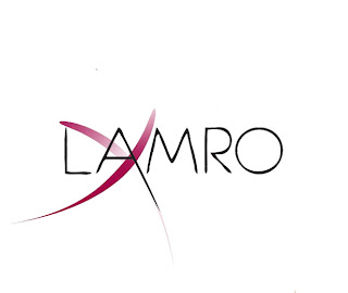
I scanned in my final type style in Photoshop and the lines came out rather rough. I dragged the type into illustrator then used 'live trace' to smoothen the lines giving me this outcome below.
dragging it back into Photoshop and rasterising the smart object, I added purple stroke across the type.
using a large size eraser with an opacity of 30, I lightly went of the strokes, creating a gradient making it look a bit glosser a s a make up logo.
I played around with the alignment of the strokes finalising the image below
To make my logo look more apparent for its purpose, I decided to add a female silhouette head. using the eraser, I got rid of all the unwanted areas. I put the image behind the head making the opacity level 19
the final touch was adding in Arial font displaying 'freelance make up artist'
Picture reference:
http://www.colourbox.com/preview/2308312-771264-vector-silhouette-african-woman.jpg [Accessed on 28th July 2013]
http://media.merchantcircle.com/28295916/Mpi-Logo_full.jpeg [Accessed on 28th July 2013]


No comments:
Post a Comment